Post by Seanstone on Feb 15, 2012 2:33:38 GMT -5
I know Rollo showed interest in making a scatterplot, so here it is, along with some other useful info.
In this section of keeping a fishing log I will cover how to make scatterplot graphs within the spreadsheet programs Microsoft Excel, and Open Office Calc. First I want to cover possible headings for the columns you may want to keep in your fishing log, as well as where to find the data to fill each of those columns with accurate and reliable data.
In the fist part of "Keeping a Fishing Log.....The Basics" we covered a few of the possible headings one can use in their log, but I really didn't explain why. I'll do my best to explain some of those here; There are a few basic elements that all fishing logs must have whether simple or complex. These are Date, Location, Time (Start and End), and a column for the fish caught. This will allow the angler to make general observations on fishing conditions from the past month, or years. IE. I caught 10 largemouth on May 2 last year out of my pond when fishing from 7am-10am, but I only caught 3 largemouth on May 5 last year when I fished from 12pm-3pm. The angler can then to hypothesize why he/she had greater success one day over the other. Was it because I fished earlier on May 5?, Wast it a better moon phase? How was the barometric pressure? Wind? This brings me to the next point, keeping a general log tends to leave you asking more questions than you have answers for. Don't fret, there is a way to get all of the elements you are looking for, as long as you kept the date and time you fished.
Recently I found a website that allows you to look at past weather conditions by location. Some of the data collected is in five minute increments while other days have hour increments. The website can be found at Wunderground.com, Here is what the home page looks like.

To access let's say, the weather data for May 5, 2011 for Columbus, Ohio start by clicking on the "Local Weather" tab and then selecting "History Data". Then fill out the data that it asks for. Location: Columbus, Ohio, Date: May 5, 2011. This page will show you all of the weather related data you will need to know. Scroll to the bottom of the screen for the Hour by hour data. It should look like this.To change the date, simply scroll to the top and change the date and hit enter.
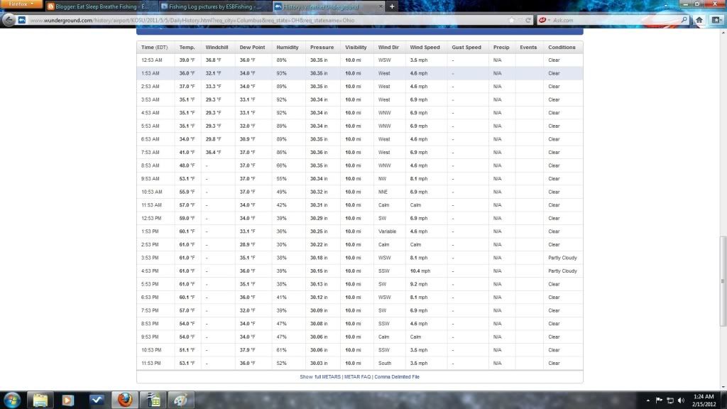
From this you can get a general idea of the recorded temperature from start to end, the windchill, dew point, humidity, pressure, wind direction, wind speed, gust speed, precipitation, events, and conditions of each hour. Here you can begin to get a good idea of what kind of other elements you want to keep track of in your fishing log. I personally keep track of beginning temperature, ending temperature, humidity, pressure, wind direction, wind speed, precipitation, and conditions of each trip. It's free, easy to access so why not? After all, I will teach you how to compare each of these with your fish caught to measure your success by each element via a scatterplot shortly. You might be surprised at what relationships you can find.
Other elements that one might keep track of are baits used (both artificial and natural), Moon phases, water temperature, individual species of fish caught (I will elaborate on why individualized columns are important in a moment), total number of fish by trip, Total points (or other qualitative measure), girlfriend/wife's fish, buddies fish, and a general comments column. These are the columns that are currently in my log, but who knows in the future some angler or scientist might come up with a crazy idea that seismic wave activity affects fish activity, then I'll add a column for that as well. (River Monsters television show reference.) In the end it's really up to the angler, only you will know what you want to track.
Now that we have covered a broad range of elements that one can keep track of, we can now look into how we can use those elements to determine trends in fishing success. For this demonstration I am going to use an "edited" version of my log from last year. By edited I mean that all of the locations have been removed but they are color coded so that you can see which trips were to the same locations over the course of the year. This will not look as neat and clean as the first run through, but if you click on the images they will enlarge.
OK here's how you would make a scatter-plot graph based from an excel file. (Sorry if I make it too simple for you some of you, I just want to make sure that its as easy as possible.) The open office "calc" database program is very similar in selecting data, however inserting the table is slightly different....explained later. My "edited" fishing log looks something like this.
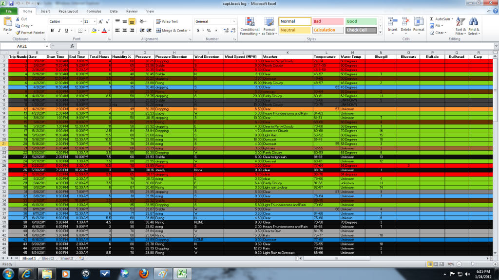
The first step is to Highlight a column of data that you want to compare. Lets start with wind speed. Begin by pointing the mouse at the title, "Wind Speed(MPH)", which is located in column J. Holding the left clicker on the mouse drag to the bottom column. Make sure not to go to far and get the total row. This log is color coded by locations, so just stop at the last black row. (Horizontal) It should now look like this.

Now to select two rows at once you will now need to hold CTRL on your keyboard. This key is located in the far left bottom corner. While holding Ctrl, Repeat this step for the channel catfish column, column "S" Hold your mouse over channelcats title and click the left side of the mouse and drag toward the bottom, stopping at the last black row. Make sure not to get the total. Your screen should now look like this: Note here that there is more to my log that can be seen on this screen, thats why the above image begins in row 1, and the image below ends in column 116. The columns extend well past the screen as well, indicated by the scroll a the bottom left.

You can now release the ctrl button. Make sure not to click any other cells or you will have to restart the process again. Now look to the top of your screen for a tab that is labeled "INSERT", It will be third from the right. You will want to click insert and then click the scatter chart under the chart headings. It will look like this. Open Office's Calc program: "Insert" tab, "Chart", "XY(Scatter)" and so on.

You will now have a generic scatter-plot graph. It should look similar to this.
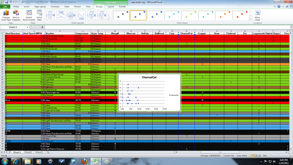
To add a line, titles, etc. Look back up to your tabs at the top of the window and you should see that you are now in a design tab. Select one of the tables that have a line. This line will show if any correlation (relationship) exists between the two elements. For me it looks like this.

Now your almost done. To change the color you will notice that on the top where your design was, you will have a few boxes with different color dots to the right. If you click on the sliding bar on the right it will then drop down a bunch of different styles. I prefer the ones near the bottom in black. I don't know if excel 97 will have them, but pick one that satisfies you. It will look something like this.

You can now click on the titles and begin to edit what they are. just click them and type the name you want.
From there it's just reading the graph. This graph shows that wind speed and number of channels caught are not related. IE it doesn't have a positive correlation / and it doesn't have a negative correlation\. This isn't always the case though. Here's what the number of Largemouth Bass when compared to barometric pressure looked like.

Here you can see that there is a negative correlation between barometric pressure and number of largemouth caught. Meaning that when experiencing days of high barometric pressure I caught less bass. These kind of scatterplot graphs can be made for all quantitative data. Number of fish caught, weight of fish, wind speed, total fish, hours, etc. Fish weight by barometric pressure would be interesting to see, as well as fish weight by wind speed, or fish weight by precipitation. Questions, questions, questions. However to use qualitative data in comparisons its much different, one example would be wind direction. I'll leave that to be explained another time.
Thanks for reading,
I might be able to help those who don't have a fishing log formatted already, shoot me a pm with your email and i'll get one together for you so you can follow along with the scatterplot creation.
Sean
In this section of keeping a fishing log I will cover how to make scatterplot graphs within the spreadsheet programs Microsoft Excel, and Open Office Calc. First I want to cover possible headings for the columns you may want to keep in your fishing log, as well as where to find the data to fill each of those columns with accurate and reliable data.
In the fist part of "Keeping a Fishing Log.....The Basics" we covered a few of the possible headings one can use in their log, but I really didn't explain why. I'll do my best to explain some of those here; There are a few basic elements that all fishing logs must have whether simple or complex. These are Date, Location, Time (Start and End), and a column for the fish caught. This will allow the angler to make general observations on fishing conditions from the past month, or years. IE. I caught 10 largemouth on May 2 last year out of my pond when fishing from 7am-10am, but I only caught 3 largemouth on May 5 last year when I fished from 12pm-3pm. The angler can then to hypothesize why he/she had greater success one day over the other. Was it because I fished earlier on May 5?, Wast it a better moon phase? How was the barometric pressure? Wind? This brings me to the next point, keeping a general log tends to leave you asking more questions than you have answers for. Don't fret, there is a way to get all of the elements you are looking for, as long as you kept the date and time you fished.
Recently I found a website that allows you to look at past weather conditions by location. Some of the data collected is in five minute increments while other days have hour increments. The website can be found at Wunderground.com, Here is what the home page looks like.

To access let's say, the weather data for May 5, 2011 for Columbus, Ohio start by clicking on the "Local Weather" tab and then selecting "History Data". Then fill out the data that it asks for. Location: Columbus, Ohio, Date: May 5, 2011. This page will show you all of the weather related data you will need to know. Scroll to the bottom of the screen for the Hour by hour data. It should look like this.To change the date, simply scroll to the top and change the date and hit enter.

From this you can get a general idea of the recorded temperature from start to end, the windchill, dew point, humidity, pressure, wind direction, wind speed, gust speed, precipitation, events, and conditions of each hour. Here you can begin to get a good idea of what kind of other elements you want to keep track of in your fishing log. I personally keep track of beginning temperature, ending temperature, humidity, pressure, wind direction, wind speed, precipitation, and conditions of each trip. It's free, easy to access so why not? After all, I will teach you how to compare each of these with your fish caught to measure your success by each element via a scatterplot shortly. You might be surprised at what relationships you can find.
Other elements that one might keep track of are baits used (both artificial and natural), Moon phases, water temperature, individual species of fish caught (I will elaborate on why individualized columns are important in a moment), total number of fish by trip, Total points (or other qualitative measure), girlfriend/wife's fish, buddies fish, and a general comments column. These are the columns that are currently in my log, but who knows in the future some angler or scientist might come up with a crazy idea that seismic wave activity affects fish activity, then I'll add a column for that as well. (River Monsters television show reference.) In the end it's really up to the angler, only you will know what you want to track.
Now that we have covered a broad range of elements that one can keep track of, we can now look into how we can use those elements to determine trends in fishing success. For this demonstration I am going to use an "edited" version of my log from last year. By edited I mean that all of the locations have been removed but they are color coded so that you can see which trips were to the same locations over the course of the year. This will not look as neat and clean as the first run through, but if you click on the images they will enlarge.
OK here's how you would make a scatter-plot graph based from an excel file. (Sorry if I make it too simple for you some of you, I just want to make sure that its as easy as possible.) The open office "calc" database program is very similar in selecting data, however inserting the table is slightly different....explained later. My "edited" fishing log looks something like this.

The first step is to Highlight a column of data that you want to compare. Lets start with wind speed. Begin by pointing the mouse at the title, "Wind Speed(MPH)", which is located in column J. Holding the left clicker on the mouse drag to the bottom column. Make sure not to go to far and get the total row. This log is color coded by locations, so just stop at the last black row. (Horizontal) It should now look like this.

Now to select two rows at once you will now need to hold CTRL on your keyboard. This key is located in the far left bottom corner. While holding Ctrl, Repeat this step for the channel catfish column, column "S" Hold your mouse over channelcats title and click the left side of the mouse and drag toward the bottom, stopping at the last black row. Make sure not to get the total. Your screen should now look like this: Note here that there is more to my log that can be seen on this screen, thats why the above image begins in row 1, and the image below ends in column 116. The columns extend well past the screen as well, indicated by the scroll a the bottom left.

You can now release the ctrl button. Make sure not to click any other cells or you will have to restart the process again. Now look to the top of your screen for a tab that is labeled "INSERT", It will be third from the right. You will want to click insert and then click the scatter chart under the chart headings. It will look like this. Open Office's Calc program: "Insert" tab, "Chart", "XY(Scatter)" and so on.

You will now have a generic scatter-plot graph. It should look similar to this.

To add a line, titles, etc. Look back up to your tabs at the top of the window and you should see that you are now in a design tab. Select one of the tables that have a line. This line will show if any correlation (relationship) exists between the two elements. For me it looks like this.

Now your almost done. To change the color you will notice that on the top where your design was, you will have a few boxes with different color dots to the right. If you click on the sliding bar on the right it will then drop down a bunch of different styles. I prefer the ones near the bottom in black. I don't know if excel 97 will have them, but pick one that satisfies you. It will look something like this.

You can now click on the titles and begin to edit what they are. just click them and type the name you want.
From there it's just reading the graph. This graph shows that wind speed and number of channels caught are not related. IE it doesn't have a positive correlation / and it doesn't have a negative correlation\. This isn't always the case though. Here's what the number of Largemouth Bass when compared to barometric pressure looked like.

Here you can see that there is a negative correlation between barometric pressure and number of largemouth caught. Meaning that when experiencing days of high barometric pressure I caught less bass. These kind of scatterplot graphs can be made for all quantitative data. Number of fish caught, weight of fish, wind speed, total fish, hours, etc. Fish weight by barometric pressure would be interesting to see, as well as fish weight by wind speed, or fish weight by precipitation. Questions, questions, questions. However to use qualitative data in comparisons its much different, one example would be wind direction. I'll leave that to be explained another time.
Thanks for reading,
I might be able to help those who don't have a fishing log formatted already, shoot me a pm with your email and i'll get one together for you so you can follow along with the scatterplot creation.
Sean




 .... rollo

